Check It
I led a team of three to design an app that helps people reduce social media use and stay productive. We began with user research to understand user behaviour, then turned our findings into targeted features. Through several rounds of user testing, we refined the flows and polished the UI to create an experience that improved users’ productivity.
Project Overview
About this project
Duration
- 12 weeks
Responsibilities
- Research
- Prototyping
- Iterating
- Ideation
- User Testing
- Visual Design
Design Brief
We aimed to create a digital solution focused on personal wellbeing. Our focus was on reducing social media addiction by promoting healthier online habits and encouraging users to engage in alternative activities.
Project Showcase
What is Check It?
Summary
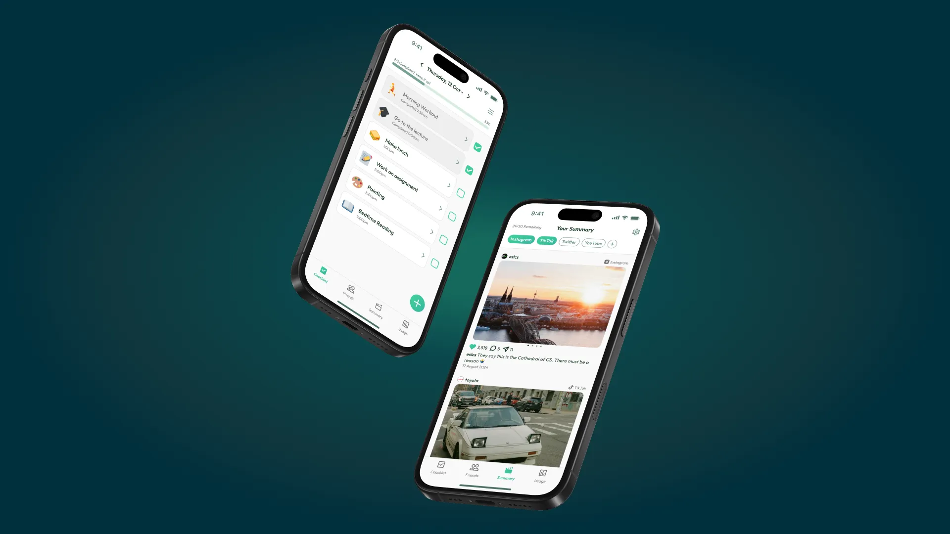
Check It is a mobile app that has a daily checklist to encourage different ways to spend time and stay productive. The app also provides a summarised social media feed, to help reduce FOMO and support create healthier digital habits.
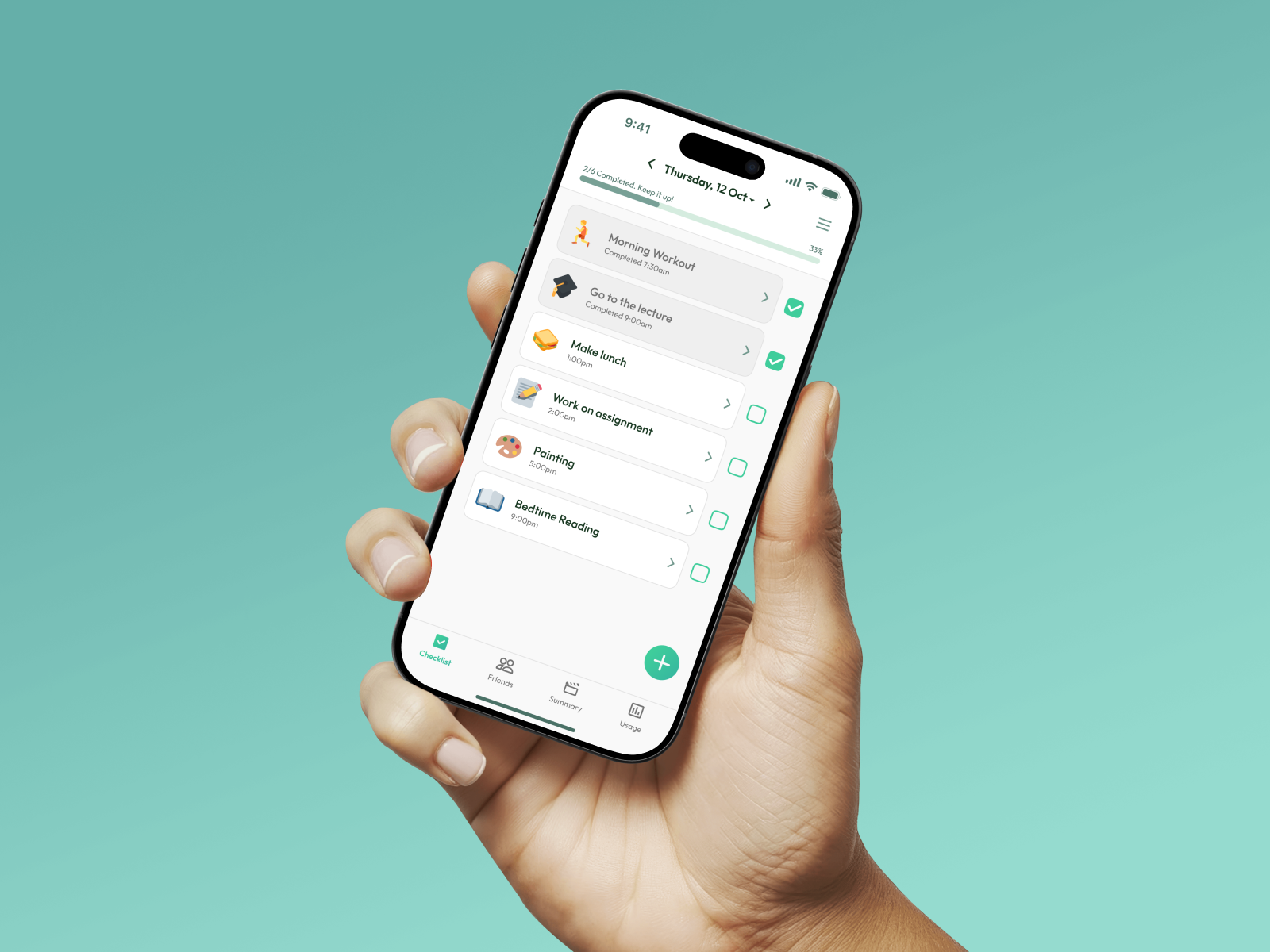
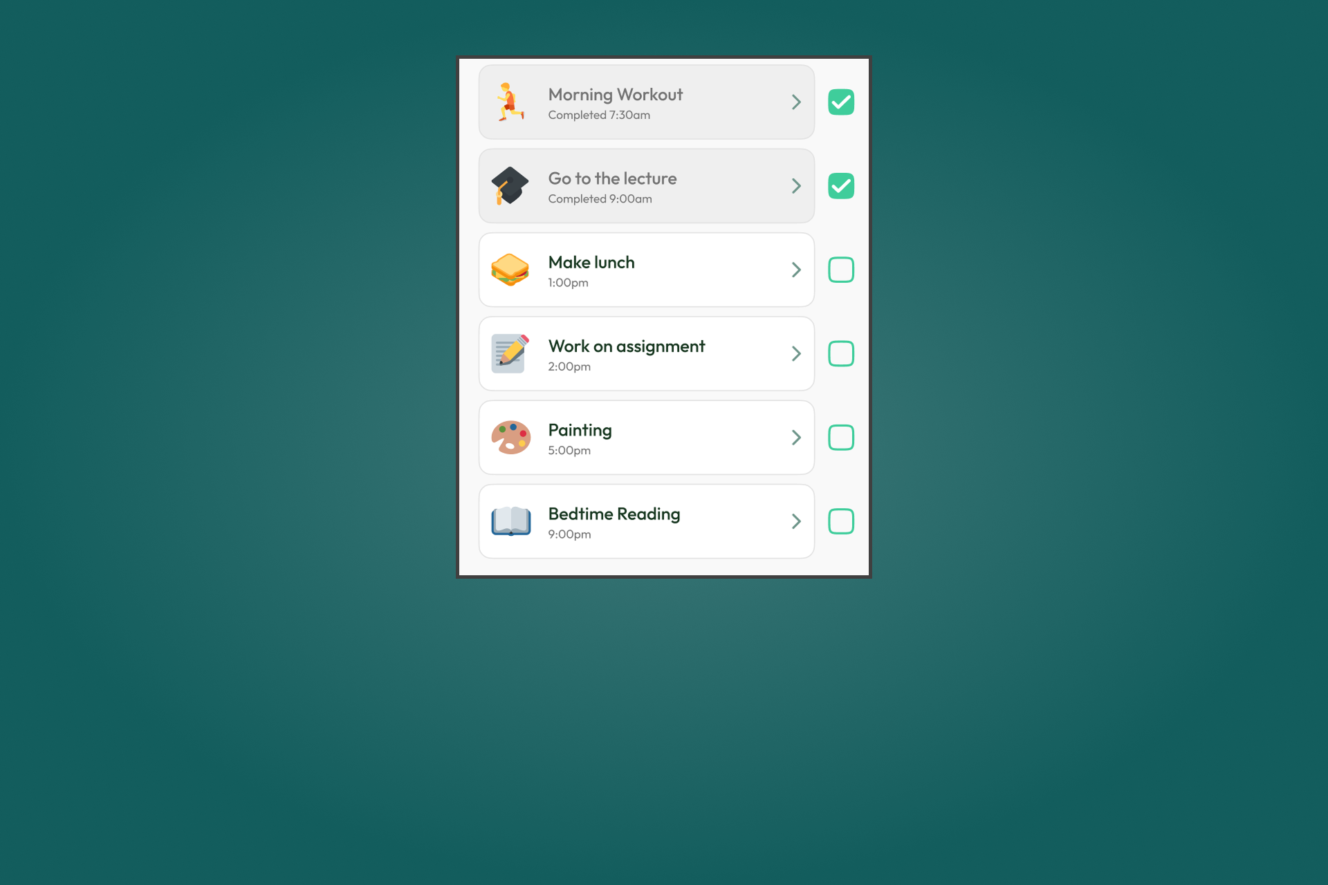
Daily Checklist
Create a daily checklist to help you stay off social media and stay productive
Tasks
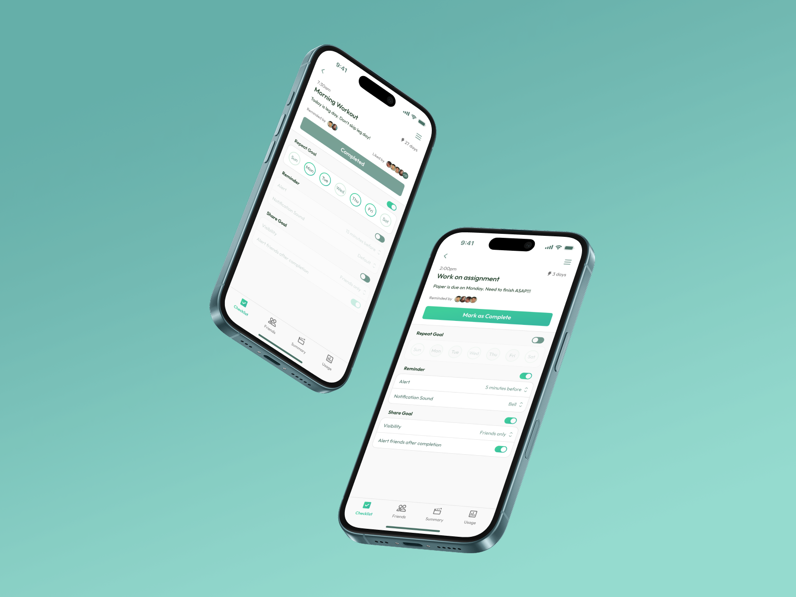
Tap a task to view details, adjust reminders and repeat settings, or check your streak.
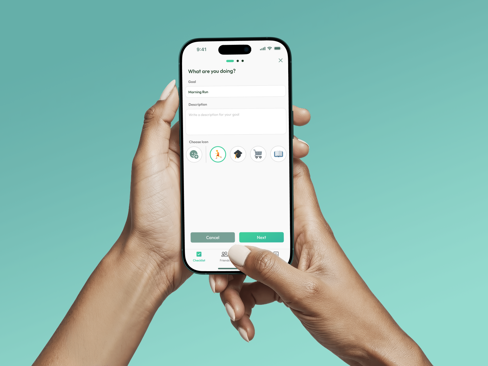
Adding a Task
Add new goals to your checklist that support focus and reduce screen time
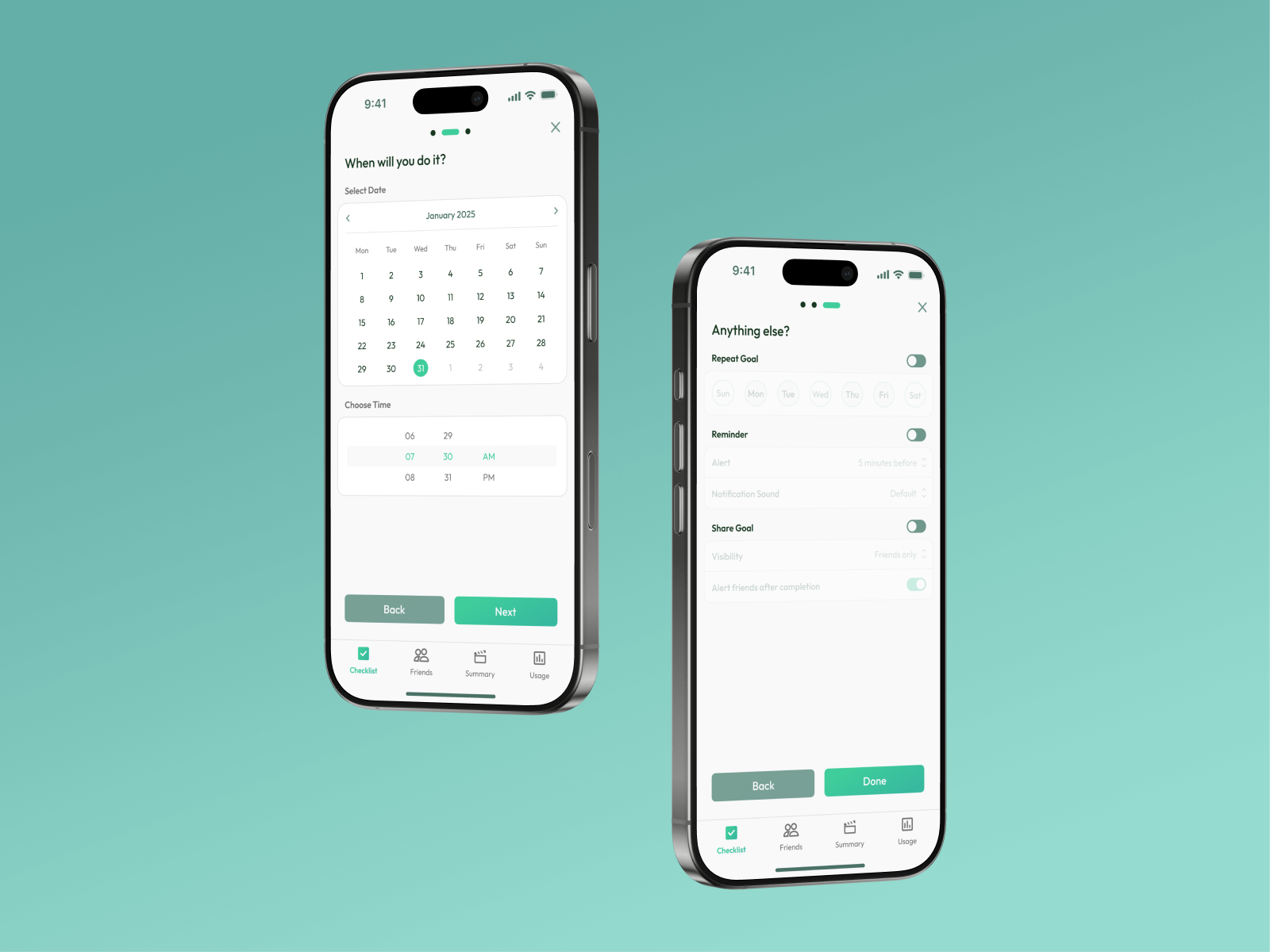
Adding a Task
Add new goals to your checklist that support focus and reduce screen time
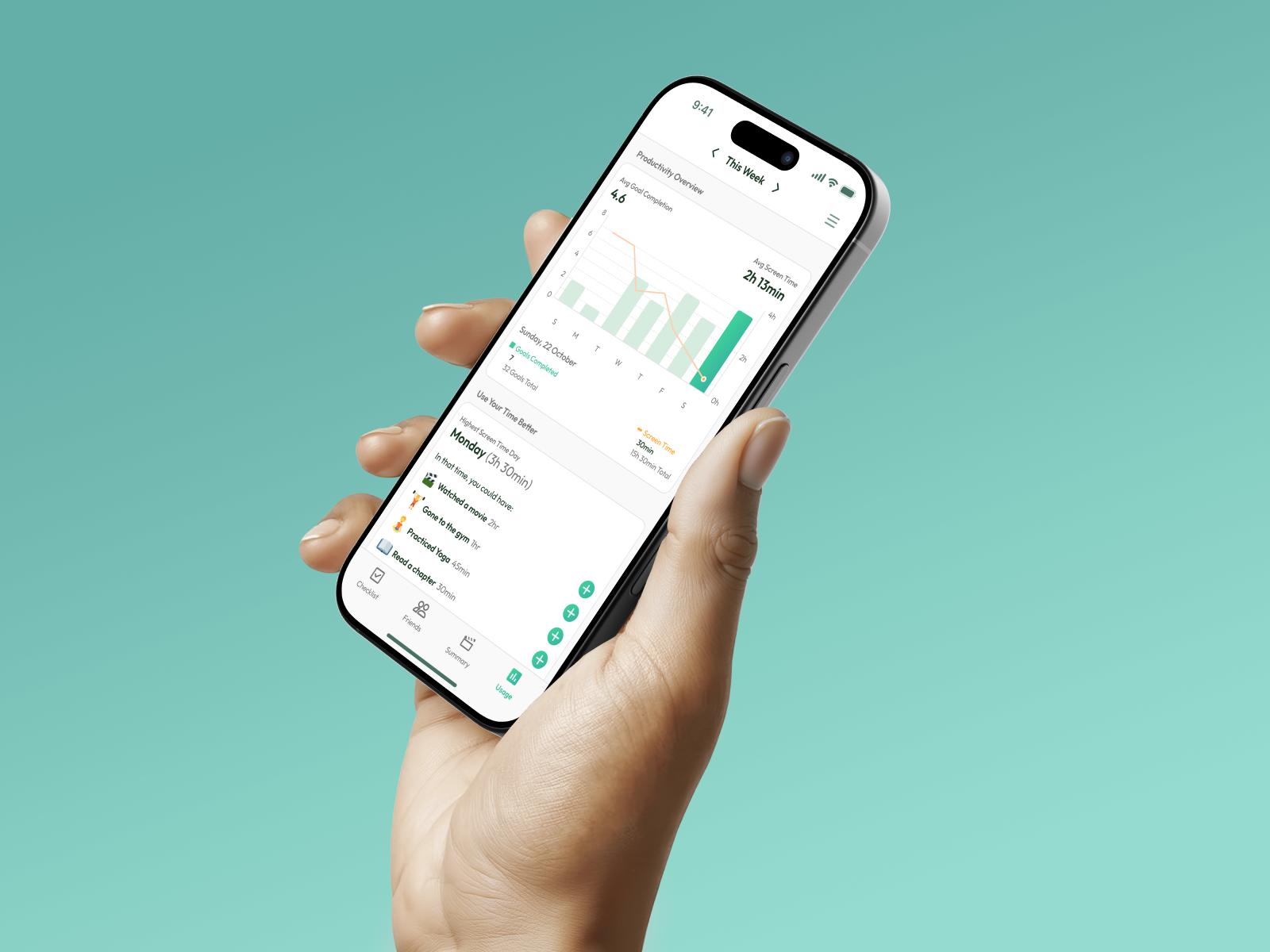
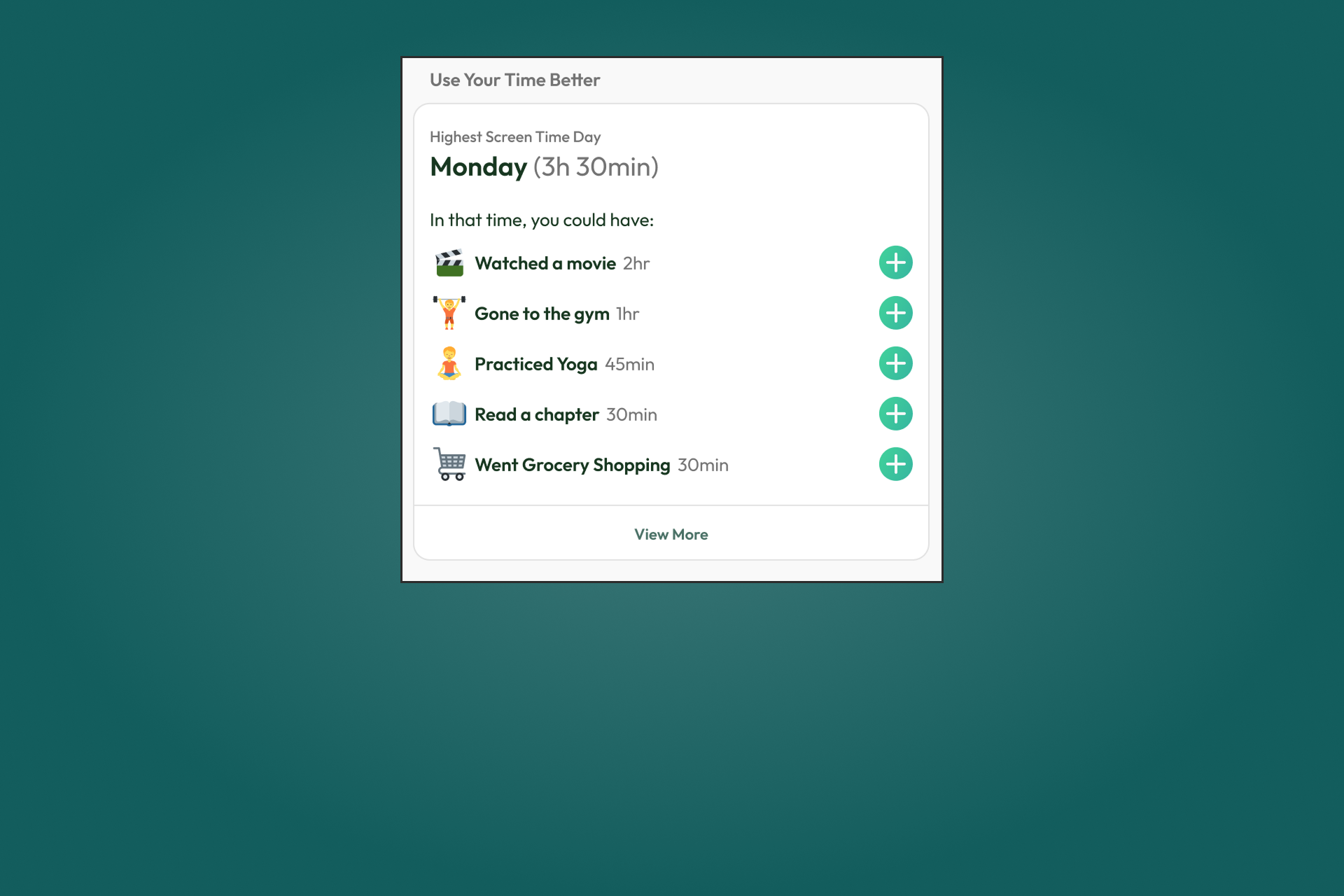
Phone Usage Statistics
Track your progress and spot patterns between goals and screen time. Get suggestions for better habits, especially on high-usage days.
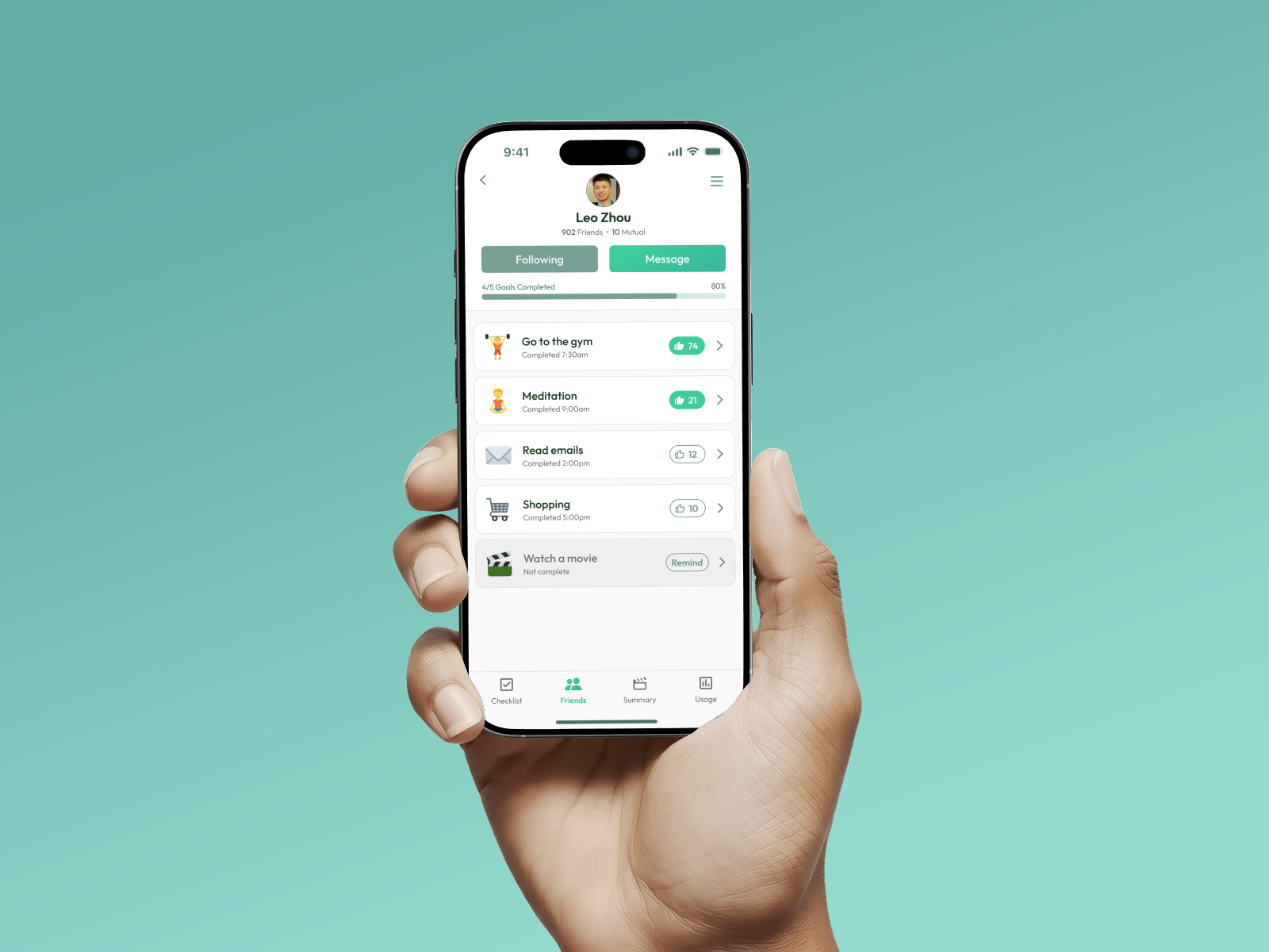
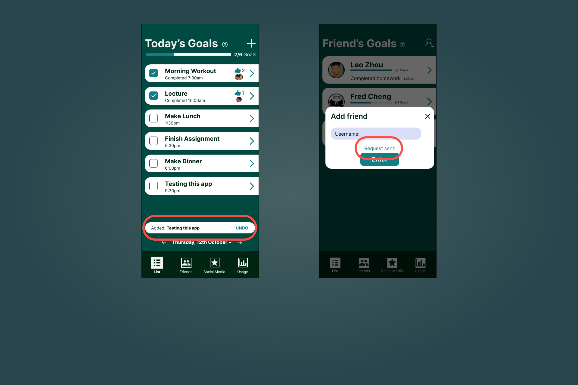
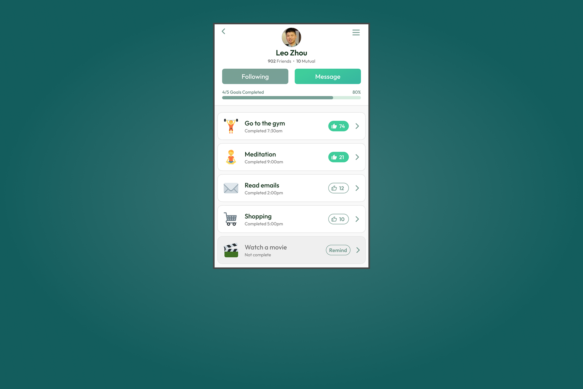
Motivate Your Friends
See how many goals your friends have completed today and stay motivated together.
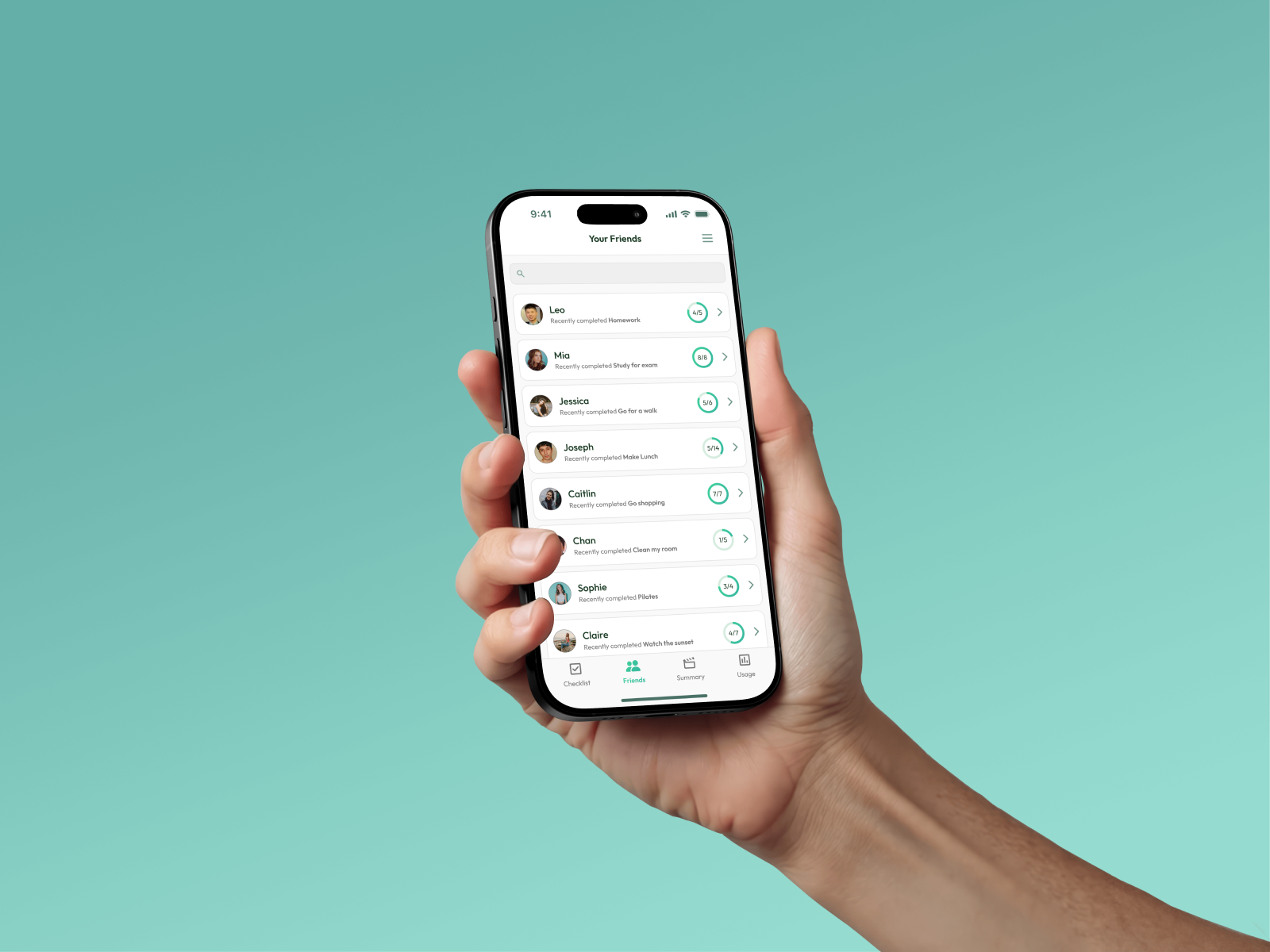
Motivate Your Friends
View a friend’s goals, give a thumbs up for completed ones, or send a gentle reminder.
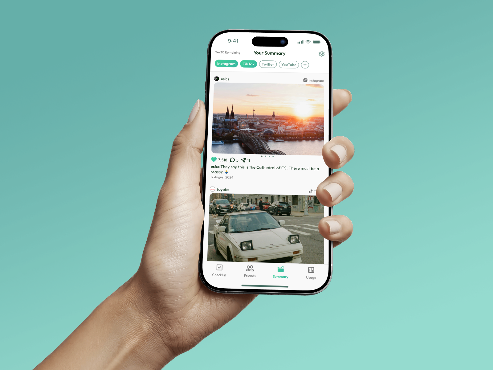
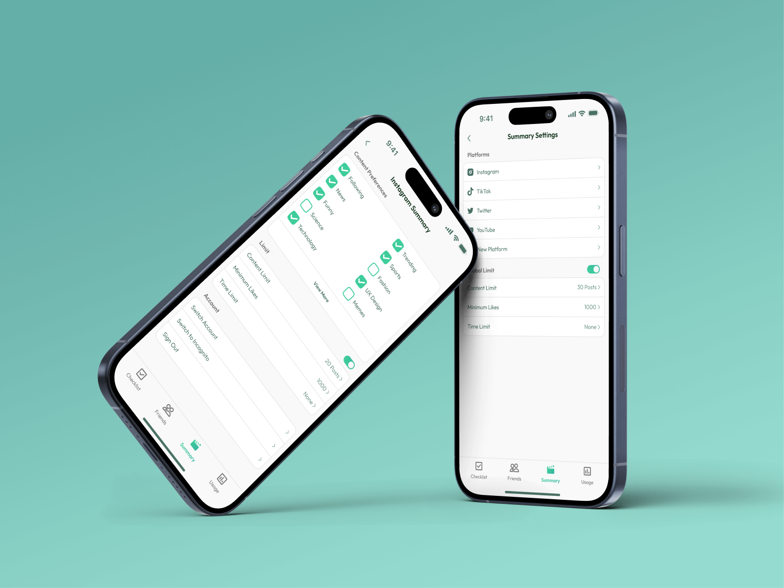
Social Media Summary
Get a curated feed with only what matters, helping you scroll less and stay focused.
Control Your Feed
Personalise your social media summary to only show what matters, so you aren't stuck scrolling all day.
Problem Area
People spend too much time on social media
People are spending more time than ever on social media platforms. While these apps help with communication, excessive use is linked to issues like social anxiety, poor sleep, and lower productivity.
The average person spends approximately 2.5 hours daily scrolling through platforms like Instagram, TikTok, and Facebook, with many often prioritising it over work and personal interactions
Our Goal
We want to inspire people to change
Our Goal
Our goal was to help people reduce social media use in a positive way. Rather than just limiting screen time, we encouraged users to spend time on meaningful activities, like connecting offline or enjoying hobbies. This makes taking a break from social media feel like a positive choice, not a restriction.
Target Audience
Young people spend a lot of time in the digital world and are especially affected by social media overuse. By focusing on this group, we aimed to understand their habits and challenges, and create a solution that encourages healthier use and long-term positive change.
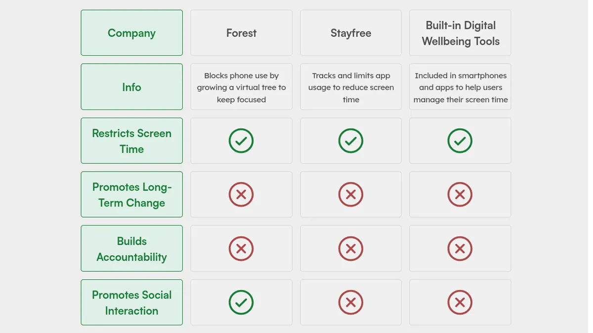
Competitor Analysis
Why social media limiters don’t work
Most productivity solutions often rely on the user’s self-discipline and motivation to be effective, but without real accountability, users can easily ignore them.
Example
Existing productivity apps, like Forest and Stayfree, focus on restricting social media use by setting time limits or locking users out of certain apps. Most major social media platforms also include built-in tools to track and manage usage.
These approaches can feel restrictive, and many users stop using them because they don’t align with what the user wants. What users really want is to find enjoyable alternatives that naturally make them spend less time on social media.
User Research
Understanding user behaviour
Understanding our target audience was essential to designing a solution that fits their needs and wants. To learn more, we used three research methods to gather a broad range of insights.
Questionnaires
We collected quantitative data about our target audience’s daily social media use. The questions focused on how social media affects their daily lives, including its impact on sleep and productivity.
Interviews
Our interview questions were designed to explore why people use social media regularly and how they feel it affects their lives.
Online Ethnography
We observed conversations in online forums (like Reddit) to study different communities and their perspectives. This online ethnography gave us valuable qualitative data and helped us understand how these communities interact and influence each other.
User Research Insights
How people use social media
We used affinity diagramming to analyse our research findings. This method helped us organise all the qualitative data and draw useful insights from what people shared with us.
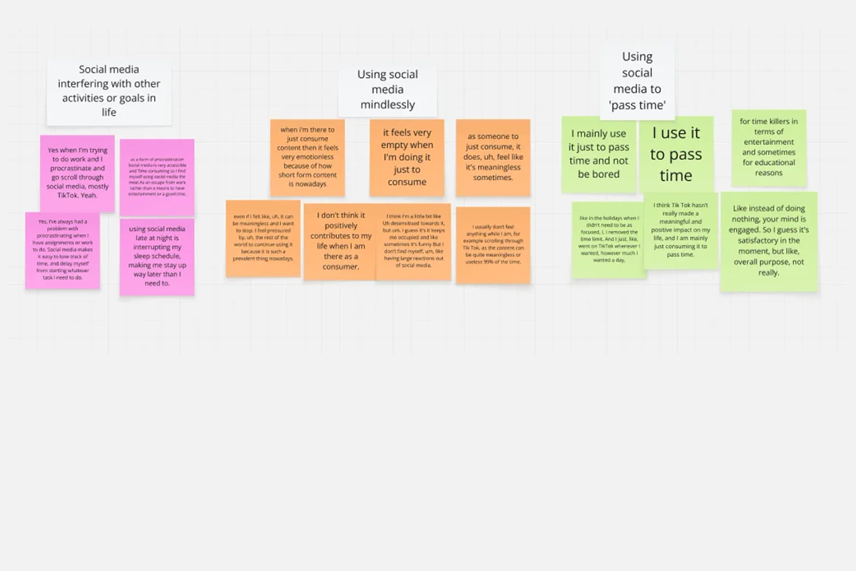
Social Media is a Habit
Many participants said they used social media just to pass the time, without a clear reason. This often led to scrolling through content without thinking, which caused them to feel like they wasted their time. Many expressed this behaviour would negatively affect their productivity and mental health.
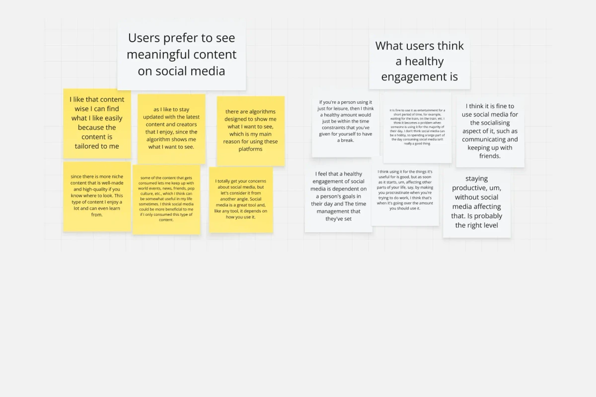
Wanting to use with purpose
Many people found social media useful but wanted to use it better. They hoped to waste less time on memes and random content, and see more posts that matched their interests or taught them something new.
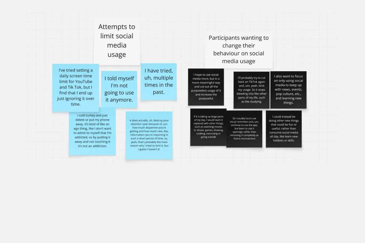
Wanting to Change Their Behaviour
Participants often expressed that they wished to cut back on the constant consumption of content. They wanted better control over their social media use so they could focus on other important parts of their lives.
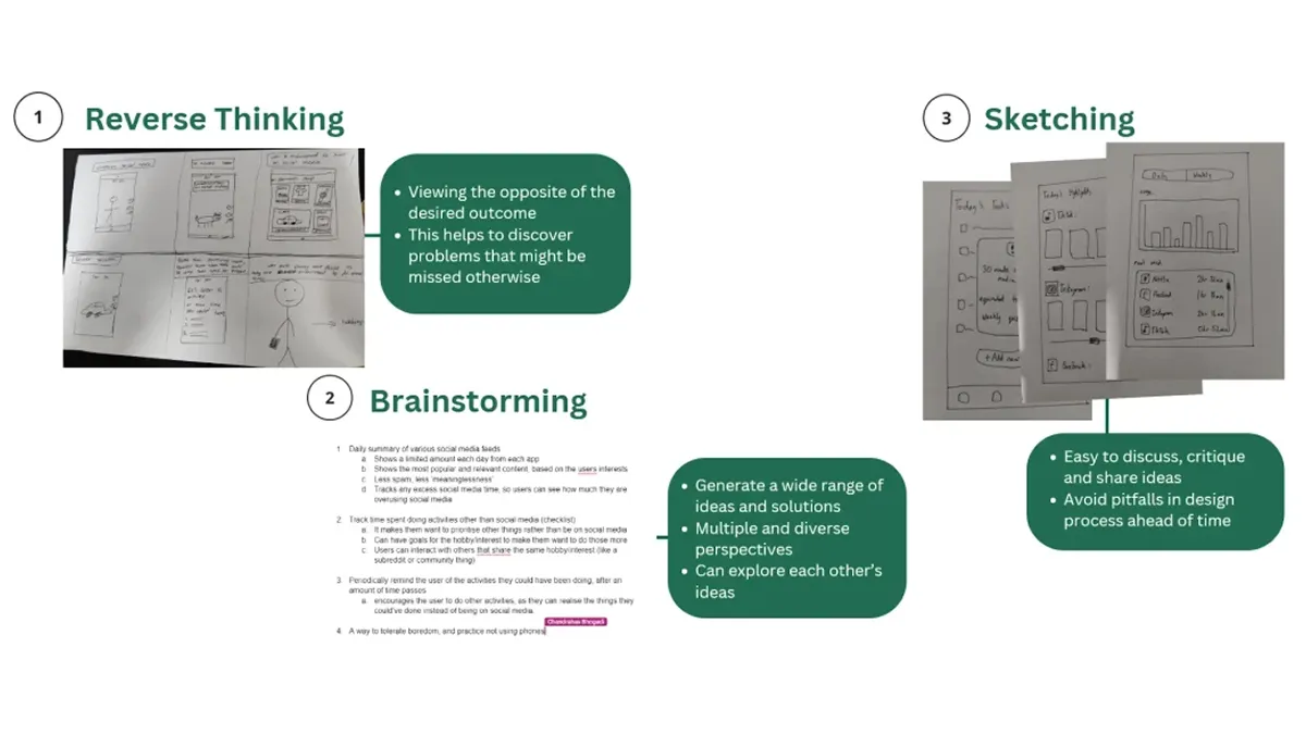
Ideation Process
Creating the concept
Once we had a clear understanding of user behaviour and their needs, we began our ideation process. To explore creative solutions, we used methods such as reverse thinking, brainstorming, and sketching to generate and develop ideas.
First Iteration
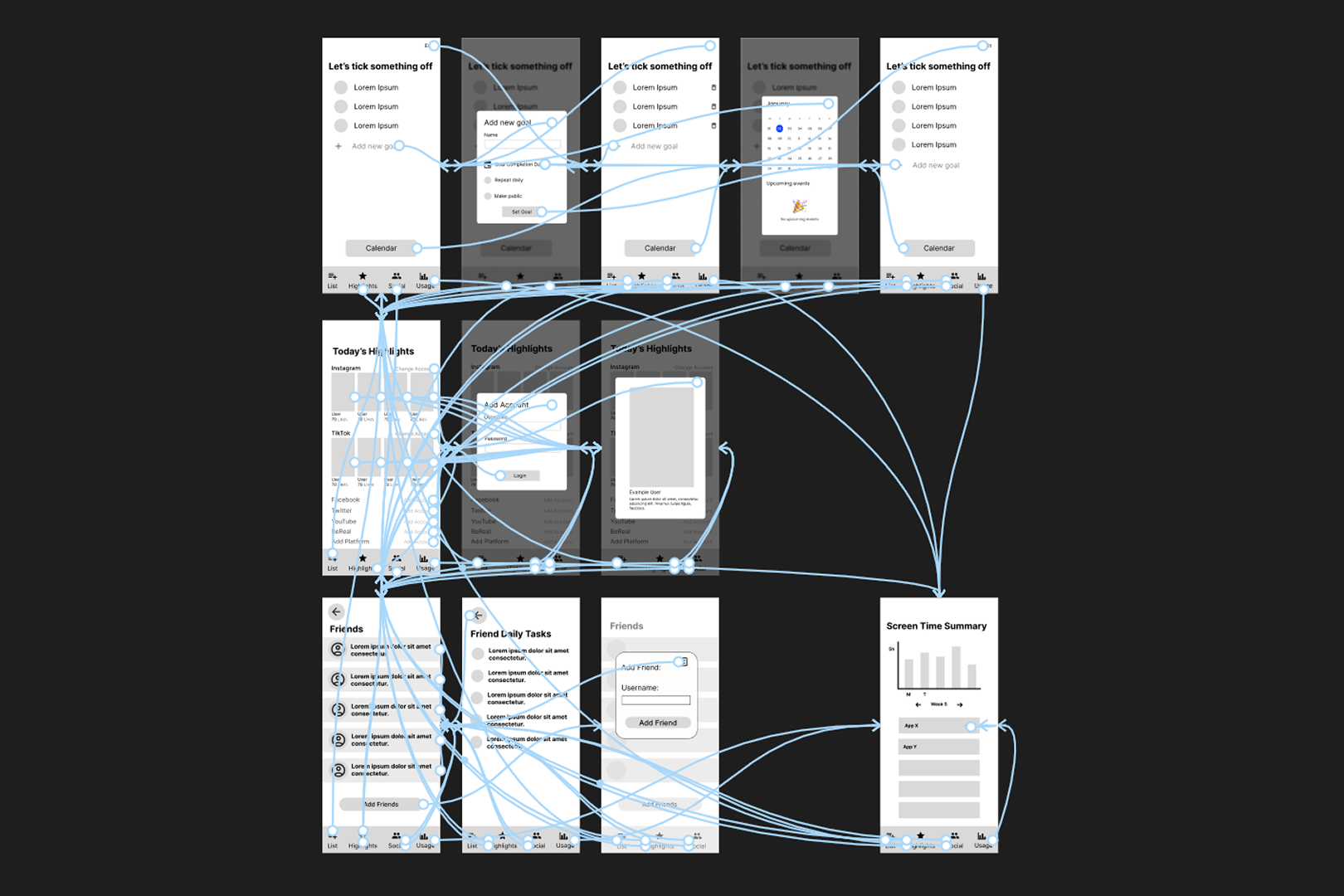
Prototyping and testing the experience
Using Figma, we made the first wireframes of what our app interface would begin to look like. I created the initial wireframe prototype by including additional screens to create a more holistic experience for usability testing.
With the main features finalised, we moved on to usability testing to guide the next stage of iteration. We created a test plan and cognitive walkthrough script to observe how users interacted with the app. Our goal was to see if it was easy to use and fit into users’ daily lives. By watching users and collecting feedback, we gained valuable insights to refine the app based on real-world use.
The initial iteration received positive feedback from testing. Participants felt the app would be helpful in boosting productivity and could fit it into their daily lives. They felt it would help them use social media less and stay focused on tasks.

Second and Third Iterations
Refining the experience with user feedback
After iterating the design, we conducted further testing to ensure the app experience was easy to use and intuitive. We used a variety of testing methods with different types of participants. Some were everyday people, while others were design students who provided more detailed and usability-focused feedback.
Think-Alouds
We asked users to complete tasks while talking through their thoughts. This gave us useful insight into how they experienced the app and where they faced any confusion.
Heuristic Evaluations
This method helped us gather useful feedback by having people review the app based on common usability principles. This allowed us to quickly highlight problems that might make the app confusing, allowing us to improve the overall user experience.
SUS Forms
We used the System Usability Scale (SUS) to collect quick, quantitative feedback. Users rated their experience through the likert scale, giving us clear scores to measure the app’s usability.
Notable Changes
Notable changes after testing
Lack of Visual Feedback
Lack of visual feedback meant users were unsure if they had successfully set a goal. To fix this, we added confirmation messages to clearly show when actions were completed. This improved the app’s feedback and helped users feel more confident using it.
Poor Colour Palette
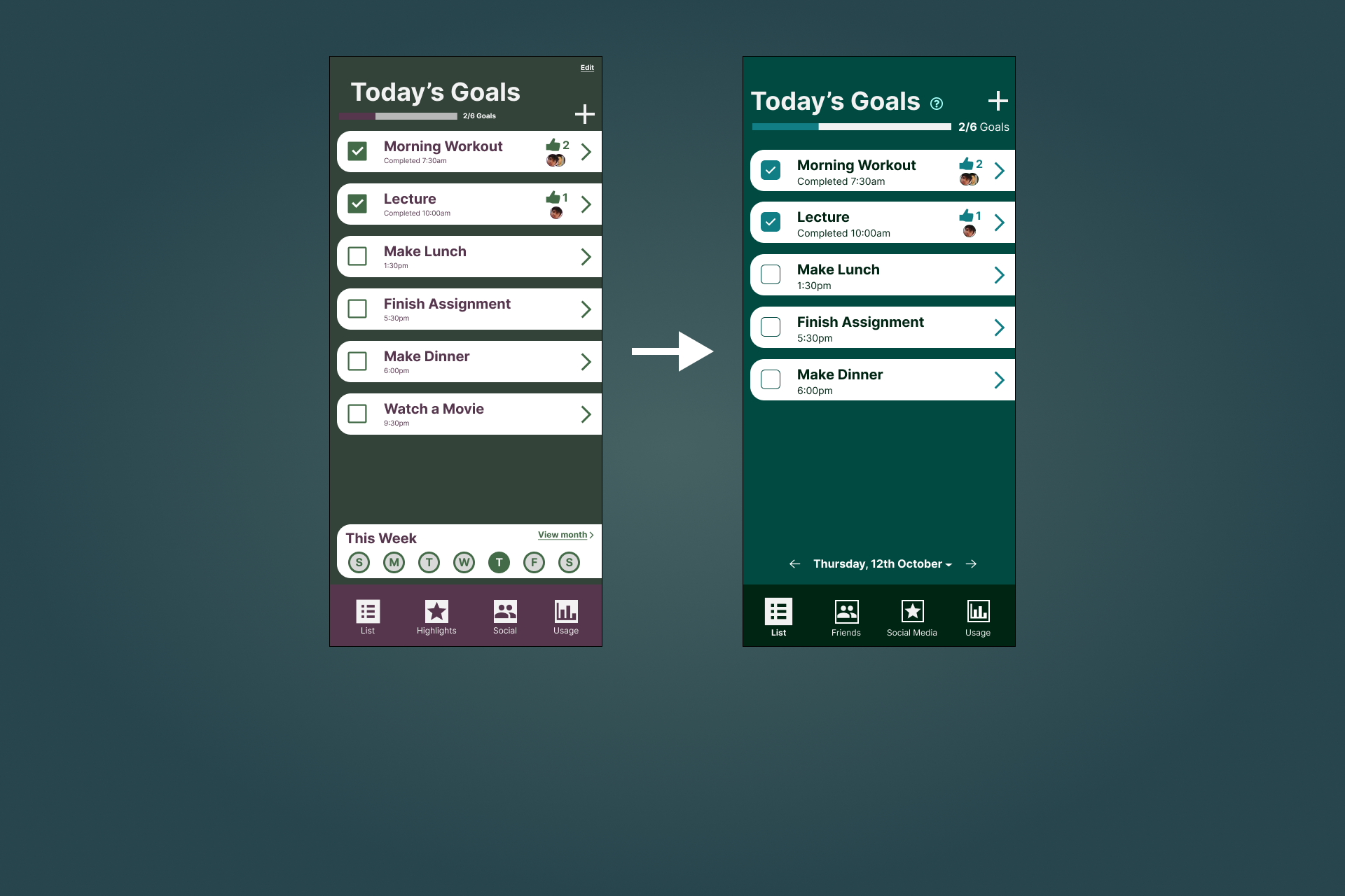
The previous version used too many colours, making the design feel cluttered. The updated version used a monochromatic palette, creating a cleaner and more consistent look that highlighted key elements better.
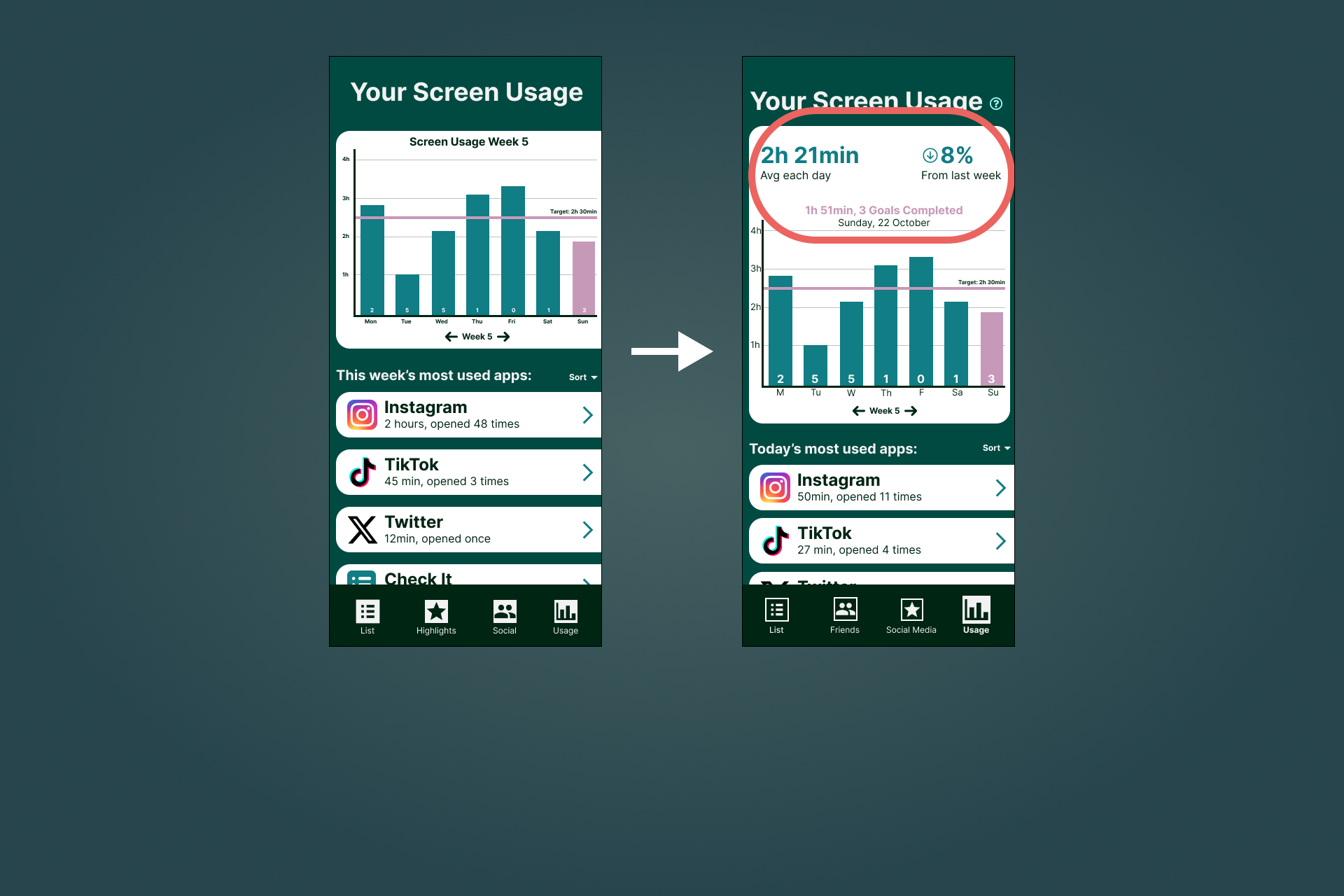
No Graph Summary
Participants pointed out that our graph required too much cognitive load and was hard to read on mobile screens. We added a simple summary at the top of the page to highlight key information, making it quicker and easier for users to see their progress.
Fourth Iteration
Revisiting the project two years later
After two years, I felt the project no longer reflected how much my skills had grown. It was my first experience with working with design tools, and it was clear I didn’t know what I was doing.
With improved skills and a stronger understanding of design principles, I revisited the project to refine both the concept and interface. This latest iteration features a cleaner look with clearer hierarchy and more consistency throughout the app.
Suggested Activities
I added a feature for suggested activities that users can add to their checklist. In previous iterations, this section showed insights into the most used apps, which proved to be a redundant feature for the goal of the app. It also didn’t encourage any change in behaviour and was already a standard phone feature.
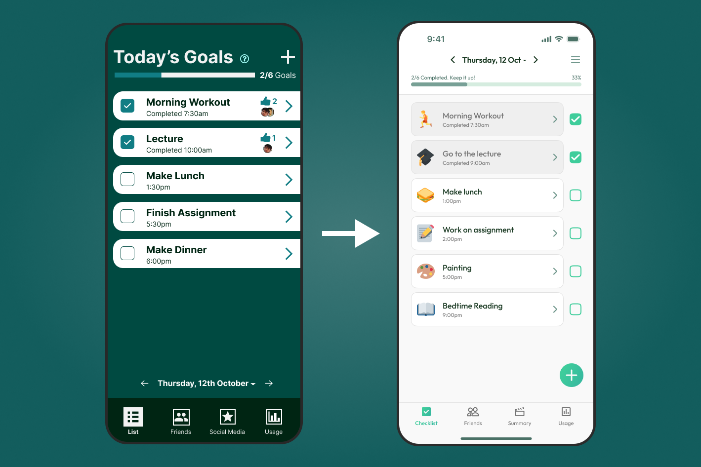
Icons for Checklist Goals
Each checklist goal can be set to show an emoji to make them easier to recognise at a glance. This means the user no longer needs to scan the labels of each task, which can save them time. It also makes the checklist more visually appealing.
Remind Friends
I added a 'Remind Me' button to let users gently nudge their friends to complete unfinished tasks. This encourages mutual support and helps friends stay productive together.
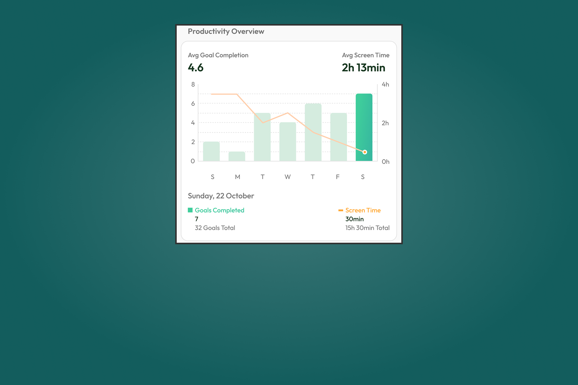
Graph Simplification
I simplified the graph to make it easier to understand. It now uses a bar graph to show how many goals were completed, with a line graph overlaid to show screen time. This makes it easy to compare goal progress with screen time and see clear patterns in behaviour.
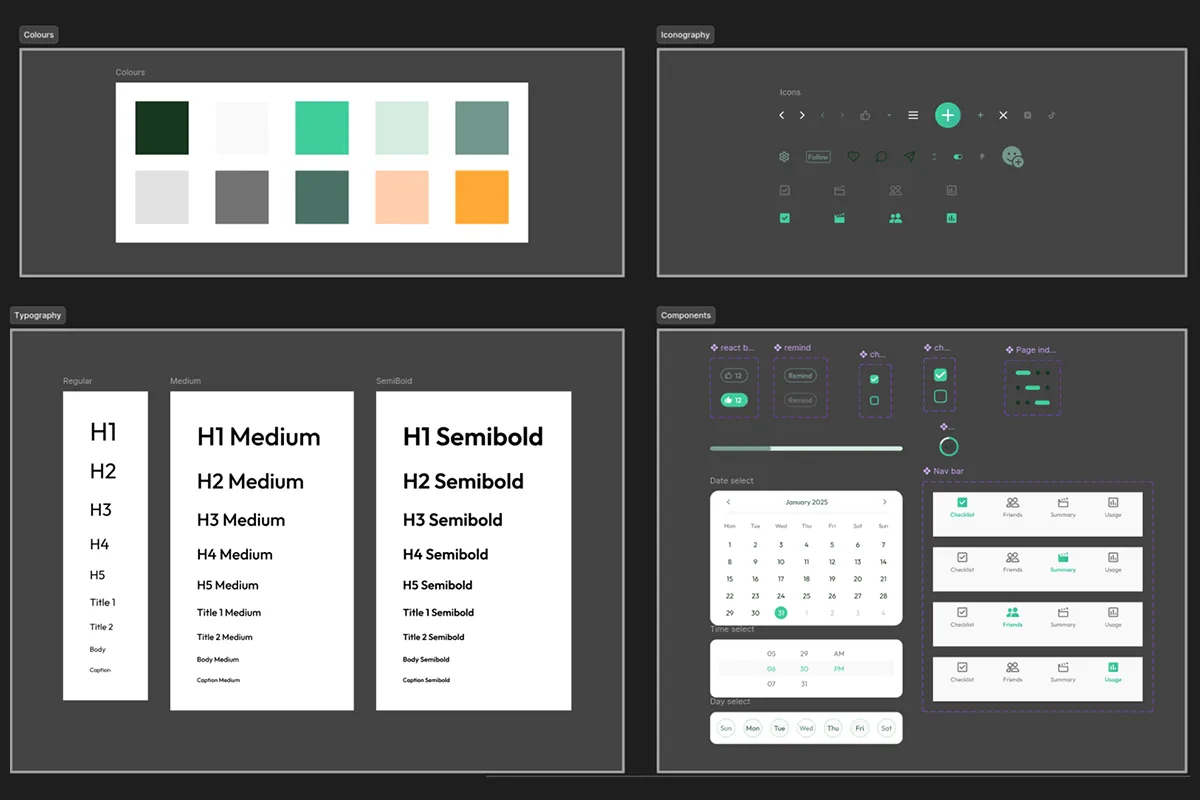
Design System
Creating the visual identity
I created a design system to maintain consistency across the entire app by setting up variables for colors, typography, and spacing. I also created reusable components which helped speed up the design process. This approach kept the design organised and made updates easier to manage.
Reflection
What I learned from this project
The Goal
The aim was to reduce social media addiction in a positive way. Rather than blocking apps or limiting screen time, the solution encourages people to spend more time on meaningful activities. I believe we achieved this goal, as the approach feels rewarding instead of restrictive.
Value of Feedback
I learned how valuable outside feedback can be. Some of the most useful insights came from people who weren’t involved in the project, and they pointed out things we hadn’t even considered, allowing us to even explore new ideas we might have missed otherwise.
Leadership Skills
I developed my leadership skills by learning how to delegate tasks effectively and keep the team on track throughout the project. I also learned to take initiative when others were unsure, helping move the project forward when decisions needed to be made.
Reflecting and Improving
Two years after we completed this project, I revisited it individually and aimed to make further improvements to the design. It was a great opportunity to reflect on how much my skills have grown since creating my first project.
Future User Testing
For the future, more user testing can help to better understand how young people use the app and what works best for them. Their feedback can shape future iterations and highlight areas for improvement. Testing with a wider range of users can also bring in new perspectives that can improve the app.